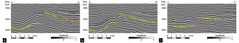
Figure 2. Three vertical slices through the seismic amplitude volume showing the yellow picks used to make the map in Figure 1a. (a) In line AA’ the horizon on the east (right) side is relatively continuous and easy to pick. (b) In line BB’ the data quality is poor along the entire picked line. (c) In line CC’ the left side of yellow horizon is also noisy, but corresponds to a high coherence (green) area in Figure 1b. In this example, the coherence map is sensitive to the overlying, higher amplitude continuous (black) trough.