|
Figure Captions
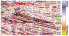
 Figure
1. Vertical seismic section displayed with gradational blue for peaks
and gradational red for troughs, compared to same section (below),
displayed in variable area/wiggle trace. Figure
1. Vertical seismic section displayed with gradational blue for peaks
and gradational red for troughs, compared to same section (below),
displayed in variable area/wiggle trace.
 Figure
2. Gas-oil contact reflection and
oil-water contact reflection, both shown by green arrows, in a producing
reservoir offshore Nigeria (courtesy of ExxonMobil Nigeria). Figure
2. Gas-oil contact reflection and
oil-water contact reflection, both shown by green arrows, in a producing
reservoir offshore Nigeria (courtesy of ExxonMobil Nigeria).
Background
and Need for  Color Color
Everybody must have noticed that seismic data
is more colorful than it used to be. This is not just to make the data
pretty, nor because today color is cheap; it is to convey information.
Huge amounts of geology can be interpreted from seismic data today --
especially reasonable quality 3-D -- and color, used properly, is an
essential tool. Wiggle traces started in the field on paper records. The
playback center of the 1950s added the variable area display to help the
interpreter follow structure. But for interpretation of stratigraphy,
hydrocarbons, porosity, and reservoir properties we need something
better.
Variable-intensity color is needed rather than
variable-area wiggle (Figure
1) for four reasons:
- Balanced appearance of
positive and negative amplitudes.
- No overlap -- and
therefore, no clipping of higher amplitudes.
- No mislocation of higher
amplitudes.
- Better visual dynamic
range.
Color Schemes
All logic and intuition in color usage comes
from the color cube, and good color schemes are based closely on it.
Contrasting color schemes are used for maps; gradational color schemes
for data.
A double-gradational color scheme, such as
seen in
Figure 1, enhances high amplitude events and is particularly
applicable to recognizing hydrocarbon effects and studying reservoir
reflections.
A single-gradational color scheme, on the
other hand, enhances low amplitude events and is particularly applicable
to fault recognition and general structural interpretation. The best
example here is variable intensity gray.
The most common double-gradational color
scheme and the most universal color scheme overall is the well-known
blue-white-red (Figure
1). The normal and conventional use
of this has blue for positive amplitude, red for negative and white on
zero. That makes it symmetrical with respect to the color cube and
symmetrical with respect to amplitude numbers. We can thus easily
compare one amplitude that is positive with another one that is
negative. We do not add any contrasting color boundaries, because they
make those amplitude levels look special -- so that they distract the
eye from the study of amplitude trends, patterns, and relationships.
This is the best data color scheme for the
novice user. Pure primary blue and pure primary red is normally best.
Natural pairing of adjacent reflections is a powerful interpretive
observation that aids reflection identification and reservoir
understanding. It is made possible only by the use of double-gradational
color.
Look again at
Figure 1, and note how the upper
high amplitude blue and red reflections very closely mimic each other.
This helps us identify them as the reflections from the top and the base
of one reservoir. The lower high amplitude blue and red reflections also
very closely mimic each other. These are the top and base of a separate
lower reservoir.
Special enhanced dynamic range color schemes
permit even better definition of stratigraphic detail. A good example of
this is the color scheme cyan-blue-white-red-yellow illustrated in
Figure 2, which provides even more visual dynamic range than
blue-white-red. Here, cyan and yellow highlight the maximum amplitudes.
Figure 2 shows a reservoir offshore
Nigeria in which gas is over oil, which, in turn, is over water. You can
easily see that the gas-oil contact is higher amplitude than the
oil-water contact, and that the gas bright spot is higher amplitude than
the oil bright spot.
Final Comments
An interpreter with a detailed objective will
be looking for amplitude trends and patterns, low amplitude indications,
and high amplitude indications. He will be looking for character and
lateral changes. He will never see these important subtleties in wiggle
trace displays. He needs color for reflection identification using
natural pairing. He needs color to help identify problems with data
phase and polarity. However, habits are difficult to break, and we are
certainly all products of our own experiences. Color is essential to
modern interpretation, and all those who have been using wiggle traces
for years -- and understandably like them -- need to make the transition
so that they do not continue missing information.
Color is also valuable for other types of
display. Structure maps should use a contrasting color scheme. Horizon
slices and most attribute maps, on the other hand, require a gradational
color scheme -- again, this helps the interpreter recognize important
trends and patterns.
Remember:
- Color bars should be
included when plots are made so that the reader knows for sure what
the colors mean.
- Displays should always be
clearly annotated, so that the reader knows exactly what he is
viewing.
Please use color and select your color scheme with care.
Return
to top.
|